
Friday, May 6, 2011
Wednesday, May 4, 2011


Thursday, April 21, 2011
Drawing Post #5: 36th Chamber of Shaolin
I can definitely relate to the protagonist’s situation when he wanted to join the Shaolin temple, and mostly when he was in it as well. Before he joined, it was something he didn’t really know a lot about, but he just knew that he wanted to do it. He imagined it being wonderful, and I’m sure he did anticipate some challenges even though it ended up being very difficult in the beginning. When I was thinking about to going to college, I imagined art school as an amazing, perfect place. I was angry that I had to go to regular college for a year, and I kept thinking that once I got to art school my life would just be all set and I would belong there. Of course I knew it would be difficult, and I wanted to be challenged and give my all. Now that I’ve been here, I know I was wrong. It’s definitely not for me. I’ve learned a lot and I have been challenged in positive ways, but I feel overloaded and unable to create anything. Much like the protagonist of the film, I was unpleasantly surprised by certain parts of the training. Unlike the protagonist, I am miserable enough to give up and run away.
However, Shaolin and art school have some fundamental differences (besides one being for martial arts and one being for visual arts). We live in a society where you don’t have to go to art school to be an “artist.” This is also because our definition of art is so broad. Shaolin kung-fu is a very specific thing, and a thing for which school and training are necessary. The fact that I can still be an artist on my own terms even if I don’t go to art school is one reason I don’t feel compelled to continue it. Another reason is that my goal was never to have “Artist” as my sole career. The film’s protagonist was in a tenuous situation: a corrupt ruler murdered his family and was out to kill him too, and he tried to help a revolutionary cause and failed. Shaolin training was something he needed to get on the way to achieving his larger goal. He knew that he could never beat the armies oppressing his town as a regular guy, so he had to become a Shaolin master. Art school has this function for many people, not just in terms of career goal but in terms of personal philosophy and desire to contribute something to the world. One of the reasons I am choosing to leave is that I want to use a different vehicle to contribute to the world. Art school doesn’t need another first-world white female.
In terms of artists and art students being similar to monks, I think this is often the case. Art school or an art practice is like a personal haven away from problems that come with “regular” jobs and day-to-day life. Artists dedicate lots of time and attention to their work because it is important to them. However, for Shaolin monks it is important for them to focus and stay detached from most worldly things. Artists need to focus on working while also taking in the world around them for inspiration and knowledge. I feel like it would be very difficult to continue making meaningful art if artists were literally monks. Nevertheless, art school can become so rigorous that it is all-consuming, and there is the prevailing stereotype of art students never having free time or never sleeping. It can be argued that this stereotype is for college students in general. I have begun to wonder why we condone this. In this respect, art school and college in general seem to be very different from Shaolin. Martial arts are about pushing your body to be at its most powerful. In college, we stay up late, drink, smoke, and totally neglect our bodies, and it’s normal for a lot of people.
Thursday, March 24, 2011
Drawing Post #4: Emily Rooney's MFA Thesis Show
Last Thursday, March 17th, I had the pleasure of seeing Emily Rooney’s MFA photography thesis exhibition in Temple Gallery. Circumstances allowed for Emily to have use of all three spaces inside the gallery, and she used this opportunity to its fullest potential with a sparse but extremely specific exhibition incorporating a variety of media.
The gallery’s initial space was populated with groupings of objects, some abstract and some representational, and three black and white photographs with ample space around them on the walls. In the next gallery space, there were only two objects: a flag with a yin-yang symbol hung on the wall by one corner, and a rectangular wood frame with a marble tile top and an organically formed, brown plaster concave in the middle of the tile. The final space was reserved only for a video projection. In the video, viewers would hear a song with dramatically downshifted pitch while seeing a stop motion animation that features an Asian man’s face, a black woman and a white woman dancing and kissing, and a black figure skater. In addition to having its own room, the song from the video could be heard throughout the gallery during the entire exhibition experience before the video was viewed.
Instead of being isolated from each other, the arrangements of works in each room correspond to each other through particular themes and features. First, there is the recurring idea of images and objects in black and white. The few photographs are developed in black and white, and one also shows a black woman and a white woman beside each other. Objects arranged on the floor of the first room also share this theme, like a black pair of ceramic shoes on a white pillow. The viewer is greeted with the yin-yang flag in the next room, possibly one of the most iconic symbols illustrating black and white of all time, and the marble top on the wood structure contains a variety of greys. A piece of drawing paper laid on the marble with a few strokes of charcoal on it continues the theme, and makes viewers very curious as to whether it is part of the exhibition or a forgotten drawing homework assignment. While we enjoy the objects, we constantly hear the extremely low pitch and minimal structure of the song, reflecting the stark and minimal nature of black and whites images and objects. The women in the video further correspond to the ideas of black and white in terms of race.
Walking back out to the marble-topped structure from the last room, it is apparent that the deep pitch of the song corresponds to the shape of the concave amidst the marble tiles. The indistinguishable syllables formed by the pitch-shifted voice allude to the lumpy, brown organic texture in the concave, as does the simple structure of vocals and piano. Observing the concave from the entrance of the last room, it is also worth nothing that the shape of the concave projects down visibly below the marble surface inside the wooden frame. The resulting lump is wrapped in white cloth and has a mysterious, visceral weight to it. On the wall opposite the structure, the flag hanging from one corner also has this quality of weight and organic shape. Revisiting the first gallery room again on the way out, we see that the abstract wood framework forms in a row on the floor correspond to the basic structure of the song, of black and white, and of the marble-topped structure in the other room. We also realize that a photo of a large marble slab being taken from a quarry was giving a hint about what kind of materials and surfaces to expect later.
Emily mentions in her MFA thesis statement, which is on the Tyler exhibitions website, that she deals with the juxtaposition of minimalism and obvious content, and the subversion of conventionally gendered objects or images to talk about queer culture and gender issues through “queered formalism.” This process allows her to challenge the way symbols have become gendered, and to explore a wider variety of creative possibilities regarding the way minimalism, formalism, and heavy content work together. I think she has achieved these goals through the themes in her exhibition, particularly through juxtaposition of stark black and white contrasts, structural outlines, and organic forms. The huge variety of media she employs deepens the effectiveness of this juxtaposition by making viewers see and hear relationships between these elements.
Tuesday, March 15, 2011
Monday, March 14, 2011
Computer Post #3: Intellectual Property
Interestingly enough, conversations about intellectual property and free stuff on the internet came up in both my 2D and Computer classes right before spring break. I feel like this happens a lot in Foundations. The same thing comes up at the same time in different classes, and whether it’s totally orchestrated or not, I like it. In Computer class we looked at a case in which a girl’s church picnic photo on Flickr became the centerpiece of a Virgin Mobile campaign in Australia, and her family sued the company. With a situation like this one, I think there is a clear set of responsibilities on each side: internet resources, like Flickr, have a responsibility to let users know that their content will become public domain when posted online, unless there are privacy options offered, and users have a responsibility to pay attention and read the terms to which they are agreeing. If a program does let the user choose to keep content private, that privacy agreement must be honored. The internet is something that seems extremely difficult to regulate. In order to keep any semblance of safety or organization, there needs to be a mutual understanding between users and people in charge of resources that are used. As more kids are born into the world of readily accessible and ever-present internet, older generations need to make sure these kids are aware of how big and how public the internet really is. I think I’ve been extremely lucky to grow up with the internet, and I believe it is truly great thing when used safely and responsibly. I’m not sure how the lawsuit against Virgin Mobile over the Flickr photo went, but I feel like the family had little chance of winning because Flickr does warn users that content they upload becomes public. However, I also don’t think Virgin Mobile made a totally ethical decision in this case, and they could have very easily considered the girl’s age and asked permission to use the photo.
In Larry Lessig’s TED talk about laws that constrain creativity and user-generated content, he talks a lot about “remixes.” These remixes are created when users are inspired by other content and make those ideas their own through some kind of creative process. This could be Team Teamwork’s mashup of Mike Jones and music from Zelda, or a videogame based entirely on abstract expressionist art, or pretty much anything. Lessig argues that it is essential for people to have the ability to make remixes, and this means having free access to content on the internet. This brings me to some “unspoken rules” regarding public domain stuff, one of which is that content needs to be significantly altered enough in it remixed form in order for a user to legitimately get credit for that new form. Another is that if someone isn’t making money off of their remix, it’s totally fine for him to use the original content. I think these make sense, but they also raise a host of questions. For example, when is content significantly altered enough? I agree with Lessig that access to content is extremely important to cultural development, and I think these rules could potentially help inspire a system of public content that is regulated enough to respect intellectual property. Aside from these basic ideas for rules, one thing I think everyone should keep in mind regarding public content is ASKING FOR PERMISSION. The internet is super-fast and convenient, so simply asking, “Hey, do you mind if I use this?” takes less than a minute. It’s also common courtesy. Content on the internet is public, but identity is often clouded or totally anonymous, and I think this can bring out less considerate behavior.
In Larry Lessig’s TED talk about laws that constrain creativity and user-generated content, he talks a lot about “remixes.” These remixes are created when users are inspired by other content and make those ideas their own through some kind of creative process. This could be Team Teamwork’s mashup of Mike Jones and music from Zelda, or a videogame based entirely on abstract expressionist art, or pretty much anything. Lessig argues that it is essential for people to have the ability to make remixes, and this means having free access to content on the internet. This brings me to some “unspoken rules” regarding public domain stuff, one of which is that content needs to be significantly altered enough in it remixed form in order for a user to legitimately get credit for that new form. Another is that if someone isn’t making money off of their remix, it’s totally fine for him to use the original content. I think these make sense, but they also raise a host of questions. For example, when is content significantly altered enough? I agree with Lessig that access to content is extremely important to cultural development, and I think these rules could potentially help inspire a system of public content that is regulated enough to respect intellectual property. Aside from these basic ideas for rules, one thing I think everyone should keep in mind regarding public content is ASKING FOR PERMISSION. The internet is super-fast and convenient, so simply asking, “Hey, do you mind if I use this?” takes less than a minute. It’s also common courtesy. Content on the internet is public, but identity is often clouded or totally anonymous, and I think this can bring out less considerate behavior.
Wednesday, March 2, 2011
Drawing Post #3: Nicolaes Maes: Back with a Vengeance
Visual analysis of artworks is interesting to me because the visual devices I write about are clearly present, but when anyone views a piece for the first time the brain processes these devices almost immediately. We don’t need to analyze works for visual devices in a composition to be effective, and they often work before we really “know” they are working. I would like to say that the inclusion of the cat in Maes’ Woman Plucking A Duck was what initially attracted me to the painting, but the absolute initial attraction was probably based on my eye catching a contrasting color or the scene’s light source. My brain would never have registered the cat if some other compositional element hadn’t caught my attention first. I’d say I was initially attracted to this piece by the atmospheric Vermeer-type lighting and the reds and oranges that stand out. Other than red and orange, the colors of this piece are predominantly black, brown, and grey. The atmosphere created by the light source and Maes’ handling of the light reminds me of late afternoon, when the sun isn’t really setting but is low. This time of day tends to be a very contemplative time for me, and can often be extremely depressing or unsettling. On a personal level, this painting draws me to moments where I have been simultaneously content with life and sorrowful because I know it has to end.
If the museum’s smell affected my perception of this piece, the effects were largely subconscious. But I did notice that much of the museum smells vaguely sweet and lived-in without being dirty or old. The room’s comfortable temperature made feel closer to the work rather than alienated from it, so temperature probably affected my perception even more than smells.
I think the paintings are grouped by region or time period, but I did find it surprising that this piece is on a wall filled mostly with landscapes. Of nine paintings, three are genres among the landscapes. These are all sized similarly enough that their close arrangement doesn’t really detract from the viewing experience. Maes’ painting is on the far left of the top row, and is placed slightly above my eye level so it was a little awkward to view. Although it is out on the fringe and up in the corner, the limited palette in comparison with the surrounding landscape paintings does make this one stand out considerably.
During my second visit to this piece, I was lucky to be around when a tour guide stopped to talk about it with her group. According to her, this seemingly innocent genre painting is actually full of 17th-century Dutch innuendo: the open vessels and open windows suggest sexuality as well as the mischievous cat. In combination with the cat, the painting apparently also sends a moralizing message about sexuality causing domestic turmoil. Once she pointed this out, I felt really thick for not considering the symbolism. Innuendo in art is obviously nothing new, but this makes me think of Bosch’s “vessel on a stick” in Ship of Fools.
Wednesday, February 16, 2011
Drawing Post #2: Fun Writing Time at the PMA!

I had a difficult time choosing what to write about for this assignment, but I eventually settled on Nicolaes Maes’ Woman Plucking A Duck. This painting, at first, seems rather unremarkable: it is only slightly larger than one square foot, the color scheme is generally subdued and without a whole lot of contrast, and the subject of the painting is an innocuous genre scene. It is absolutely a well-executed painting, but my initial reaction was to assume that Maes was trying to mimic Vermeer. This was not an accurate assumption on my part because Vermeer didn’t create his best-known works until after 1656, which is about the time Maes did this painting. The window on the left as a light source and the quiet household setting are reminiscent of Vermeer, as are the soft value transitions throughout the space that give the lighting an ethereal quality. However, the figure is depicted in very high contrast against the space she inhabits. Maes didn’t approach the figure or the objects in the foreground with the same gentle, almost hazy style as he did the background.
What is truly exciting for me in this painting is the cat. Cats have their own unique personalities, but also species-specific quirks, just like humans, and I enjoy seeing artists’ portrayals of cats. Maes has this cat crouching partially in shadow, creeping up to examine the dead duck and deciding whether or not it is necessary to pounce. His paws are planted flat on the ground with his weight on them, and his ears and eyes are fully attentive. This is how real cats behave when they investigate something new. However, artists don’t always choose to reflect the inner essence of their feline painting subjects. For example, in one of the rooms preceding the one where Maes’ painting is, there is a painting of the Holy Family by Dosso Dossi in which a cat is included in the foreground for symbolism. Dossi’s depiction of the cat isn’t “bad,” it just fits his symbolic purpose better. Dossi’s cat appears very flat because little value has been incorporated into the form, the hind paws don’t seem to actually connect with the floor, the body is rigid and geometric, and the tail is simply a black line. Contrasting these two painters’ depictions of cats highlights the roles they have in art as important symbols or as real, active subjects.
While the light source loosely helps direct our eye through this piece, the placement of warm reds and oranges also draws the viewer down along a path from the top left corner. These reds and oranges are the only colors that stand out against the calm overall darkness in the scene. The colors lead us downwards from the house’s outside wall to focus on the woman plucking the duck, then across the floor where the cat is. Instead of contrasting harshly with the dark, gently rendered background inside the house, these colors enhance the serene quality of the painting because their application is so controlled. The orange of the floor does not dominate the scene, it dissolves into grey shadows at the corners. Because the space of the room seems to recede even more when brighter colors are set against it, the darkness of the space is made extremely compelling and convincing. Highlights on the woman’s head, dress, and on the cat’s face are the most highly contrasting areas, and these may serve a symbolic purpose or simply draw attention to the figures, or just simply be the logical result of the light source. Displaying this painting in a very well-lit room full of other paintings that, in general, are more brightly colored, also creates a contrast that invites the viewer deeper inside the fictional space. If the painting wouldn’t normally stand out, it does now, because it is like a little tunnel out of the gallery into a different place. I think this was a clever way to display this painting and help viewers appreciate its contemplative tone.
The age of this work, and most of the work we see in any museum, is something that always amazes me. Maes’ painting is about 355 years old. While there are absolutely other things in the PMA that are much older, this is still old enough to be mind-boggling. People through the years cared about this painting enough to keep it intact and preserve it for 355 years, and it seems like they did a good job. There are countless works of art that have not been so lucky, which makes those that have survived even more special. We struggle with this in contemporary art and society: the question of how special works really are when there are so many created, and how many people can afford to preserve.
Here are links to the PMA site pages for each painting I talked about:
http://www.philamuseum.org/collections/permanent/49271.html?mulR=1093|3
http://www.philamuseum.org/collections/permanent/101942.html?mulR=30501|1
Monday, February 7, 2011
Misc. Post #2: Theo Jansen
A mind-boggling new favorite artist, much more conceptual and complicated than Louis Wain... Theo Jansen! Youtube and www.strandbeest.com are full of beautiful videos of his work; my links malfunctioned for some reason.

He builds giant kinetic sculptures (they're called "Strandbeests" or "Beach Beasts") that, when the wind blows on them, are totally self-propelled through mechanisms made out of plastic pipes. And according to Theo Jansen's TED Talk on Youtube, some of them have a tube that senses moisture and a grounding mechanism to keep them from blowing away in a storm. In other words, they could survive on their own out on the beaches, which is supposedly Jansen's ultimate goal. I sincerely hope that beaches in the Netherlands are actually filled with these someday. I love them. I was creeped out at first, but all they do is walk around! You can move out of their way, and it's not like you wouldn't notice them coming.
I checked his website, and he has a Physics degree. (Duh.) If someone had showed me years ago that THIS is what one can do with a degree in physics, my life might have turned out differently.
Monday, January 31, 2011
Computer Post #1: UPenn Stuff!
For my first Foundation Computer photo excursion, I went to University City! Sean works at The Blockley every Sunday night, so I started the evening there taking pictures of sound equipment. Usually Sunday night is the open jam, but tonight it was some random band for the Auto Show afterparty. God only knows how/why that ended up being at a college rock bar, but there you go. The one dude was pretty great on guitar and he had a theremin...I unfortunately didn't stick around long enough to hear him play the theremin.
When I got tired of Blockley I ran across the street (in the freezing cold, yuck) to scope out the three or four churches in the area. One is apparently the "Philadelphia Cathedral," which is super cool to me. Cathedrals are such a novelty in the US. I'm not religious, but I've always had a thing for cathedrals and carved stone decorations in general. Wish I could've gone inside... Next time I go on a photo excursion, I'm definitely going during the day and getting as warm as possible. No more cold hands and blurry photos. :[
Other than that, the only last words I have are that UPenn is fancy, and the lighting at the Blockley is not really my favorite. It just makes me feel sort of grotty and lethargic.
Also, there are always a ton of mice on the tracks on the blue line. They're too fast to photograph, but it's nice to see them. I saw one on the way back who was going to town on a bag of BBQ chips, and that made me happy.
Thursday, January 27, 2011
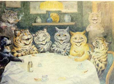
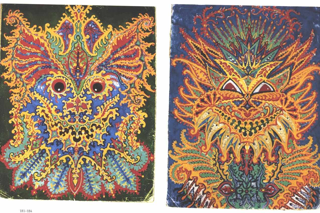
Misc. Post #1: Louis Wain
I'm obsessed with Louis Wain. He started out painting cheesy scenes of cats doing human stuff, and eventually he developed schizophrenia. As his condition got worse his cat paintings got crazier and crazier, to the point where they just became complex psychedelic designs.
Drawing Post #1: Quote Response
"The point is, that every piece of art changes your whole perception of the rest of the world for the rest of your life. And it's not a joke! And if it doesn't, then it's not art, it's a commodity." -- Lawrence Weiner responding to a question from Liam Gillick in "Between Artists" p. 20
I like this idea of defining "art" as something that makes people think and affects them forever, even in the smallest way. This definition might not be viable in every single situation, but it seems like a good start for figuring out whether things are art or just people screwing around. And even people screwing around have the potential to change out perception of the world. So I guess when it really comes down to it, the definitions of "art" nowadays can be totally arbitrary, and the stimulus we experience changes very much from person to person.
I like this idea of defining "art" as something that makes people think and affects them forever, even in the smallest way. This definition might not be viable in every single situation, but it seems like a good start for figuring out whether things are art or just people screwing around. And even people screwing around have the potential to change out perception of the world. So I guess when it really comes down to it, the definitions of "art" nowadays can be totally arbitrary, and the stimulus we experience changes very much from person to person.
Subscribe to:
Posts (Atom)